

Looking for collaboration for your next project? Do not hesitate to contact us to say hello.

Identifying Issues & Providing Solutions.
Identifying Issues
Analyzed user experience challenges, including complex navigation, delayed order updates, and limited personalization.
Providing Solutions
Simplified the interface, optimized order tracking, and introduced tailored recommendations for better engagement.
Enhanced Results
Delivered a smoother, more intuitive app experience that improved customer satisfaction, retention, and daily usage.
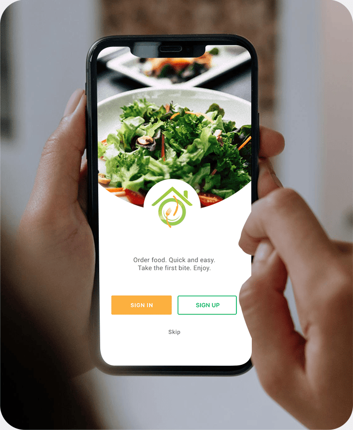
Typography & Brand Color Scheme.

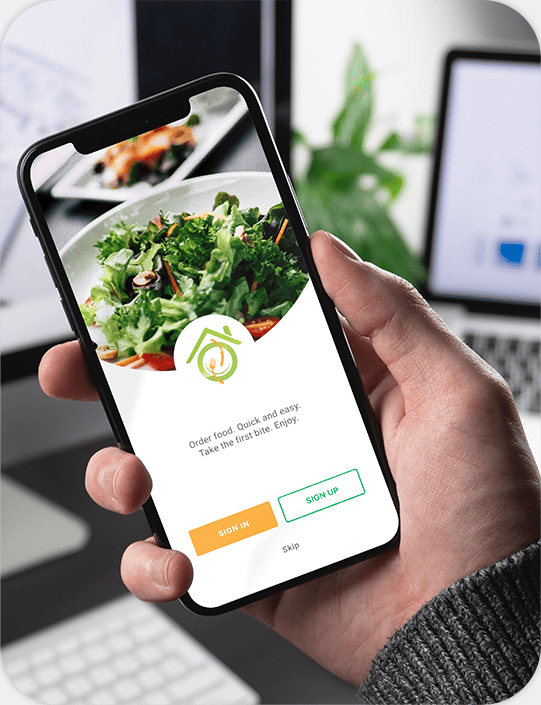
A strong digital identity begins with the right blend of typography and colors. For the Eat @Home application, we selected a clean, modern font style that ensures clarity and readability across all devices.
The brand color scheme was carefully chosen to reflect freshness, warmth, and trust. Bright, appetizing tones like red and orange highlight energy and appetite, while green accents represent health and balance.
abcdefghijklmnopqrstuvwxyz
abcdefghijklmnopqrstuvwxyz
01234567890
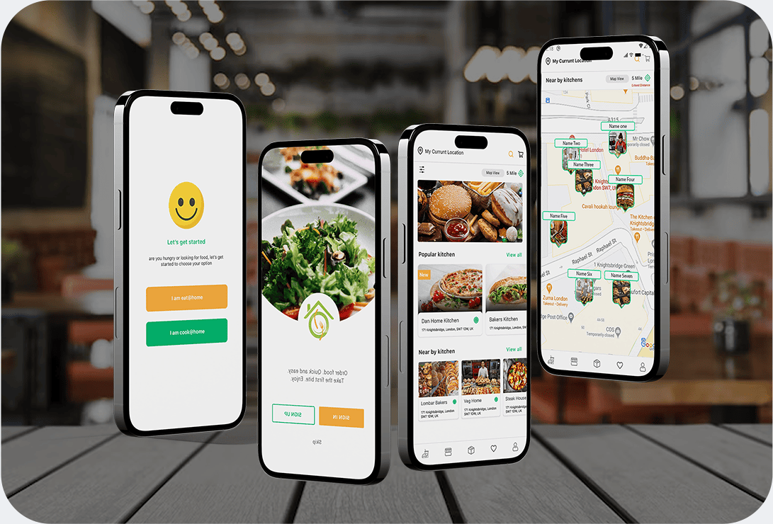
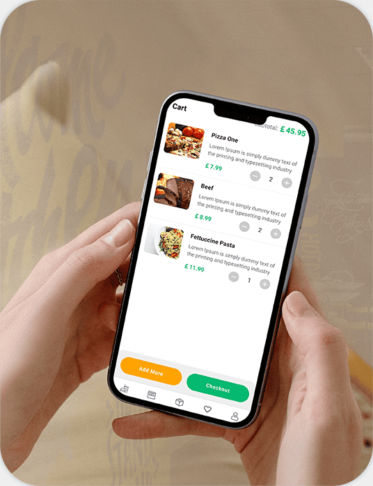
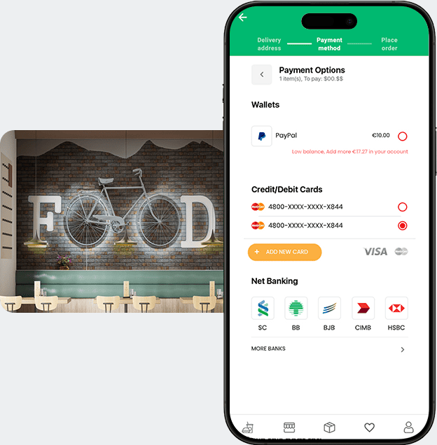
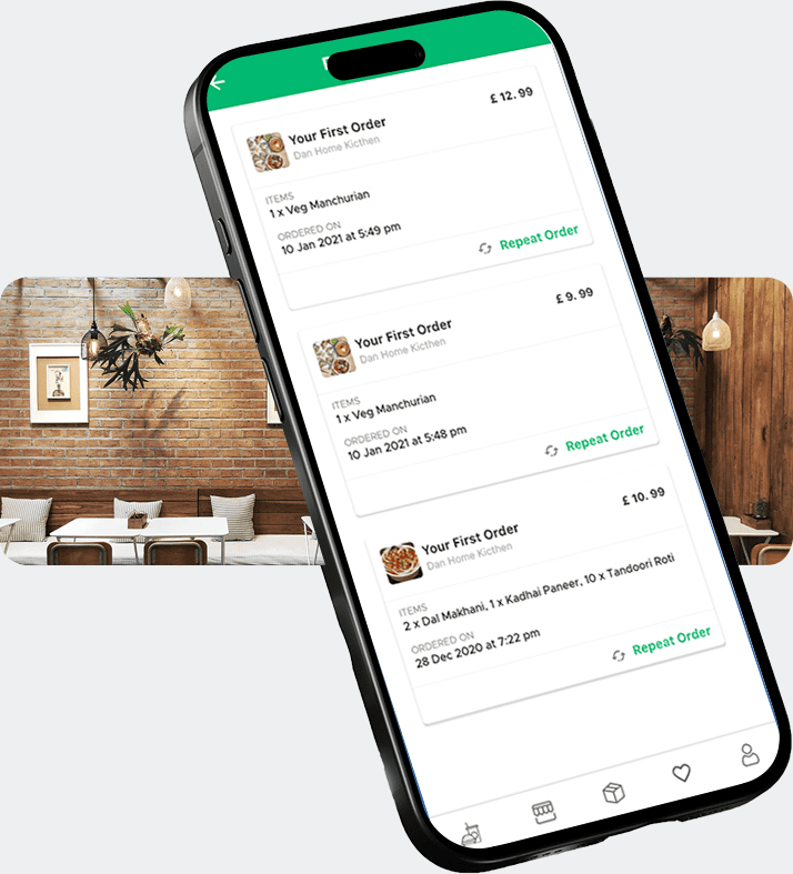
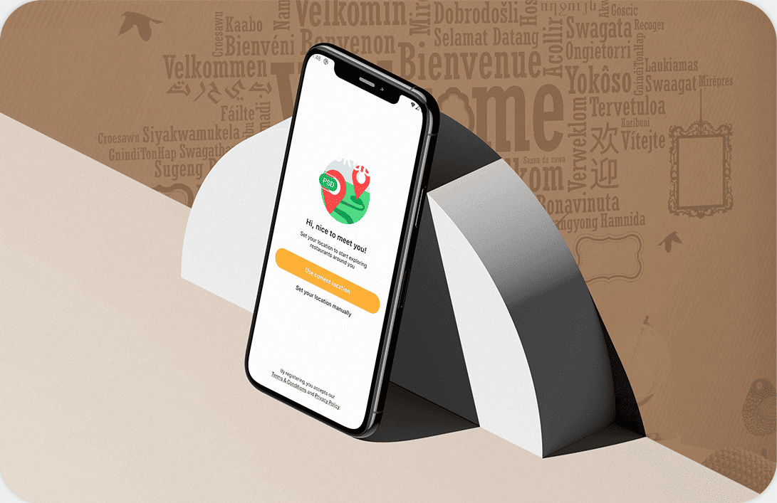
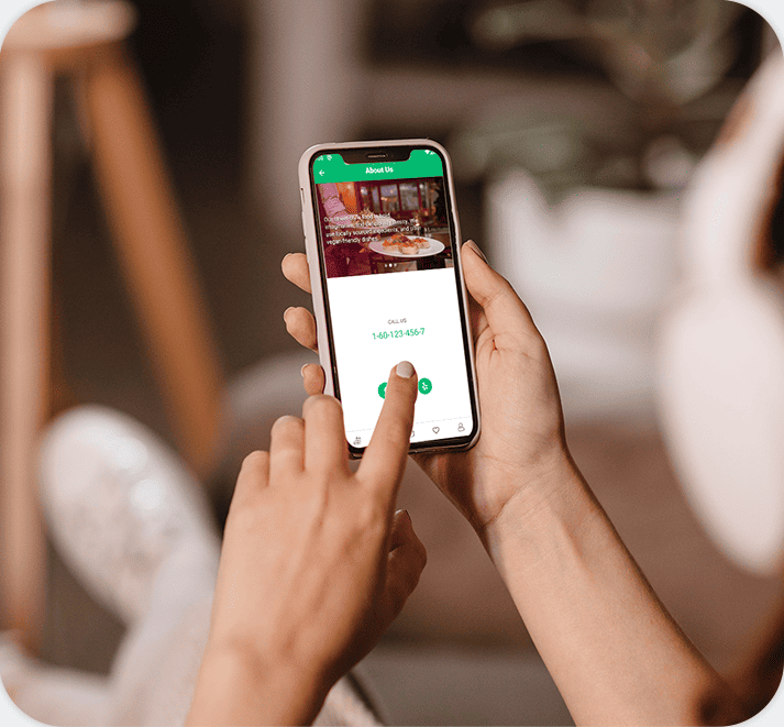
User Experience in the mobile App.
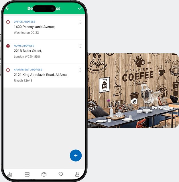
Intuitive Design
Simplified navigation ensures users can access features quickly and effortlessly.
Engaging Interface
Bright visuals and interactive elements keep users motivated and connected.
Seamless Performance
Optimized speed and functionality provide a smooth, reliable app experience.

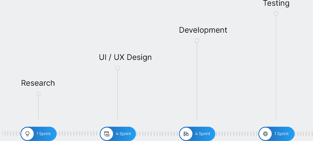
Work Progress & Accomplishments
Result
- Analytic
- Concept
- Branding
- UX Design
- UI Design
- Mobile App
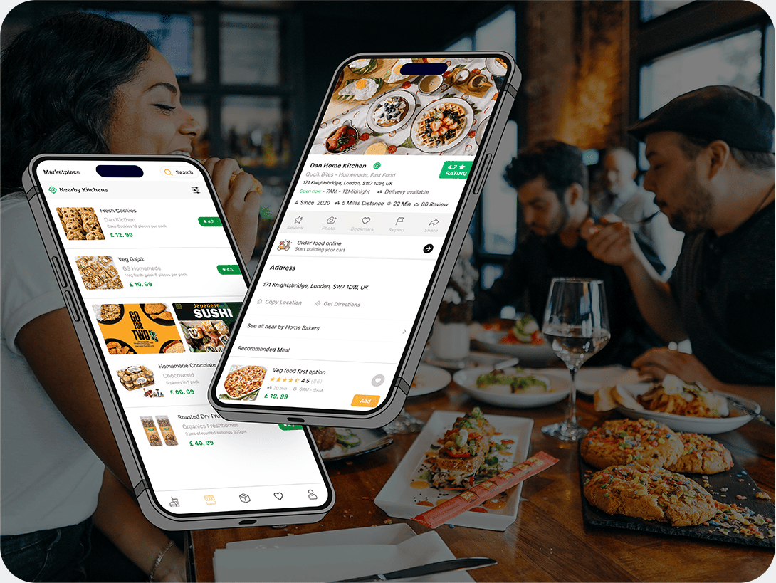
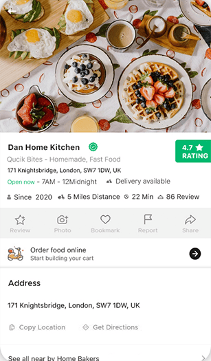
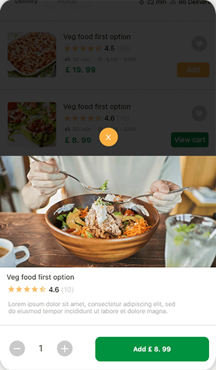
Eat @Home enhances food ordering with smooth navigation, fast performance, order tracking, and personalized recommendations, ensuring an easy, enjoyable meal experience.


6
Sprints for Project.
Eat @Home simplified ordering with intuitive design and real-time updates, boosting daily usage, trust, and reliability as a user-friendly food delivery platform.
Thanks for watching for our design.